Another home project down!! We are on a ROLL!!! (Except that, well, we started this project about 9 months ago… *cough cough* *shifty eyes*
When Jonathan and I bought our home, one of the first things we mutually agreed to work on was the entryway. In our little 1950’s ranch style home, the floor plan had the classic boxy entrance with a coat closet… functional but closed off, boring and boxy. The previous owners had a LOT of great ideas for upgrades, but they kind of did things halfway. So when they decided to turn the closet into a mudroom of sorts, it was a GREAT idea… that kind of fell flat.
They pretty much just removed the rolling closet doors, painted the walls, and then nailed some 2×6’s into the wall as a makeshift bench. The bones of a great entryway were there, but it was so raw that it just felt.. I dunno, tacky?
When the home appraiser came out, he even put in the house report under “negatives” that “the entryway closet doors are missing”. The “entryway” clearly was just that… a closet with doors missing. We decided we’d change that! We wanted to make a room that felt like it BELONGED to the entryway, with no sniff of closet to it!
Here are a couple of before and after pictures… check it out!!
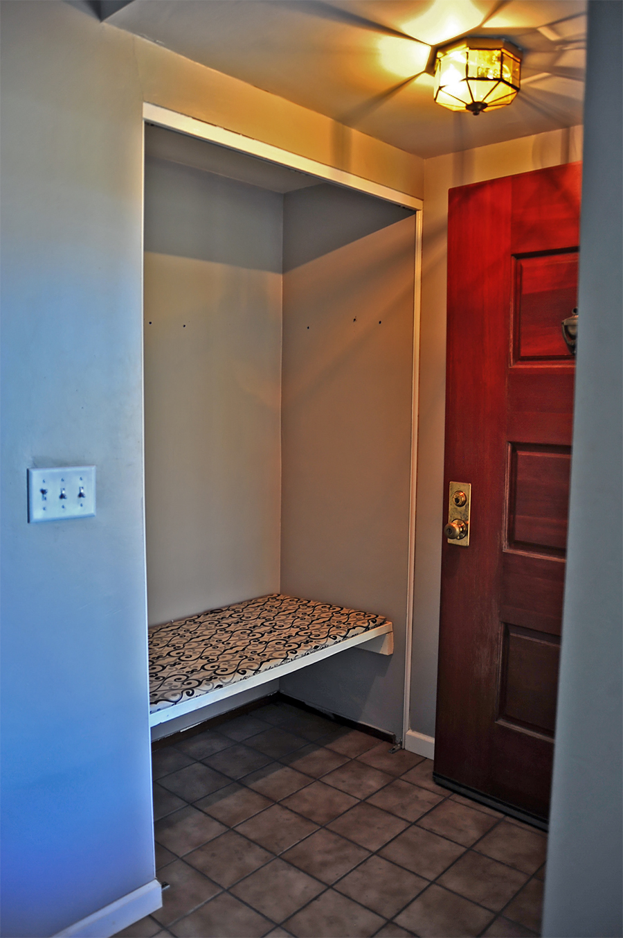
How the entryway looked on the day we moved in. You can see how this has SO MUCH potential. There wasn’t anything I really wanted to drastically change about the concept.. I just wanted to polish it, flush it out and FINISH it!
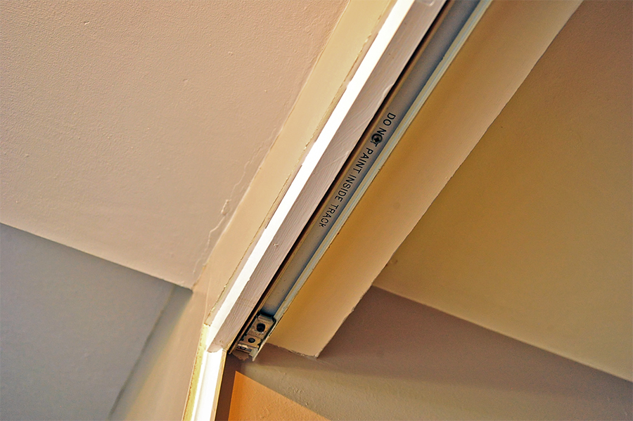
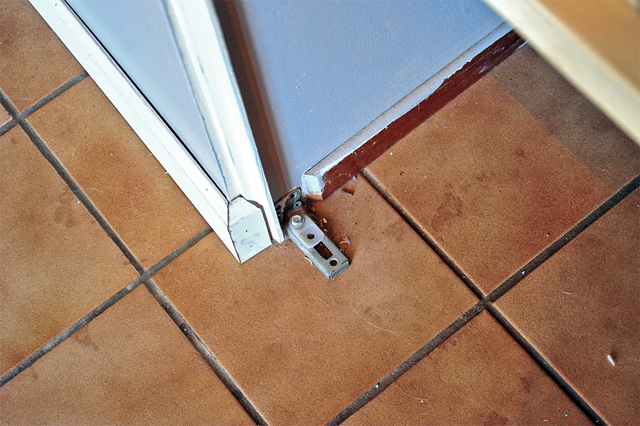
You can see how they just left the sliding door tracks intact..
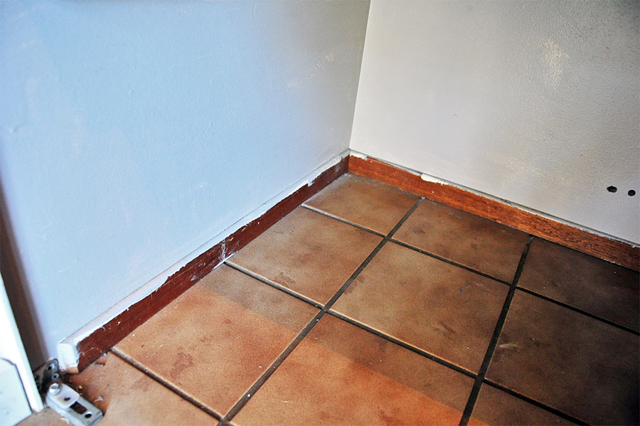
They also left the original paint splattered baseboards inside the recessed closet area, along with random holes in the drywall. (They also didn’t clean or sweep before they moved out, haha!) And did I mention I am NOT a fan of the dirty looking brown tile??!
The Upgrades We Made to the Entryway
Here is a quick rundown of the upgrades we made! First things first, we could NOT have done this project without the help and generous support of our friends, the Buckleys. Not only did they lend their expertise on woodworking with baseboards and such, but they loaned us ALL of the hardware and tools for this project – the nail guns, the saws, the drills… pretty much EVERYTHING.
Secondly, the paint that I used for this project was graciously provided by AFM Safecoat Paints. We were delighted to use this eco friendly primer and paint for our baseboards, casing, crown molding shelf and entryway bench.. I’ll be following up with a review of this awesome product SOON, so keep an eye out for it!
So on to the project details! We decided to rip out ALL of the baseboards, molding and door casings in the entryway, living room, kitchen and dining room and replace it with a nice bold, thick, beautiful design. This way the entryway baseboard and door frame had a flawless flow throughout the entire living area. Nowhere do the moldings feel jarring or different or set apart – they finally all match!
We also changed out the outdated lighting fixture to something simple, modern and energy efficient. We switched out the light switch cover to a beautiful black and brass cover. We fixed up chips and cracks in the tile, painted it a beautiful flat slate grey, and then added some quarter round floor transitions (the tile previously had a very jarring unfinished edge with a half inch drop to the hardwood).
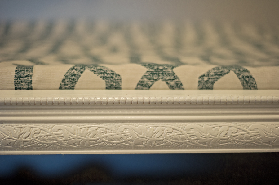
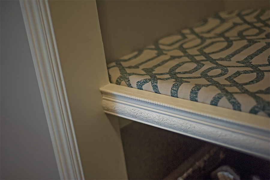
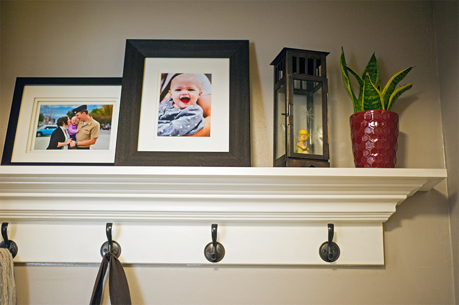
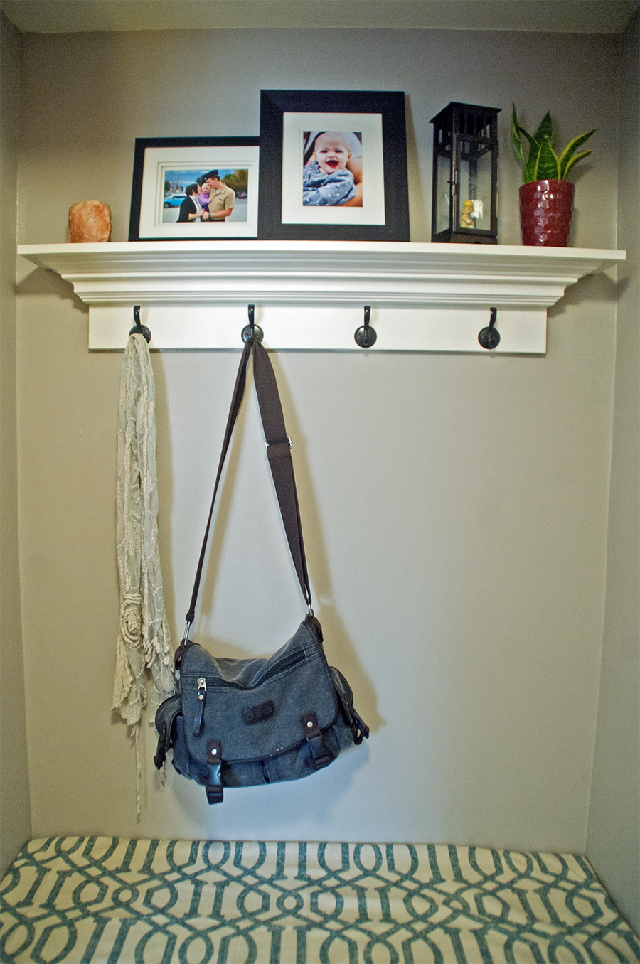
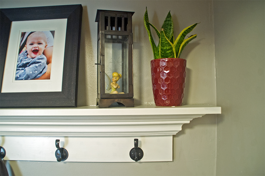
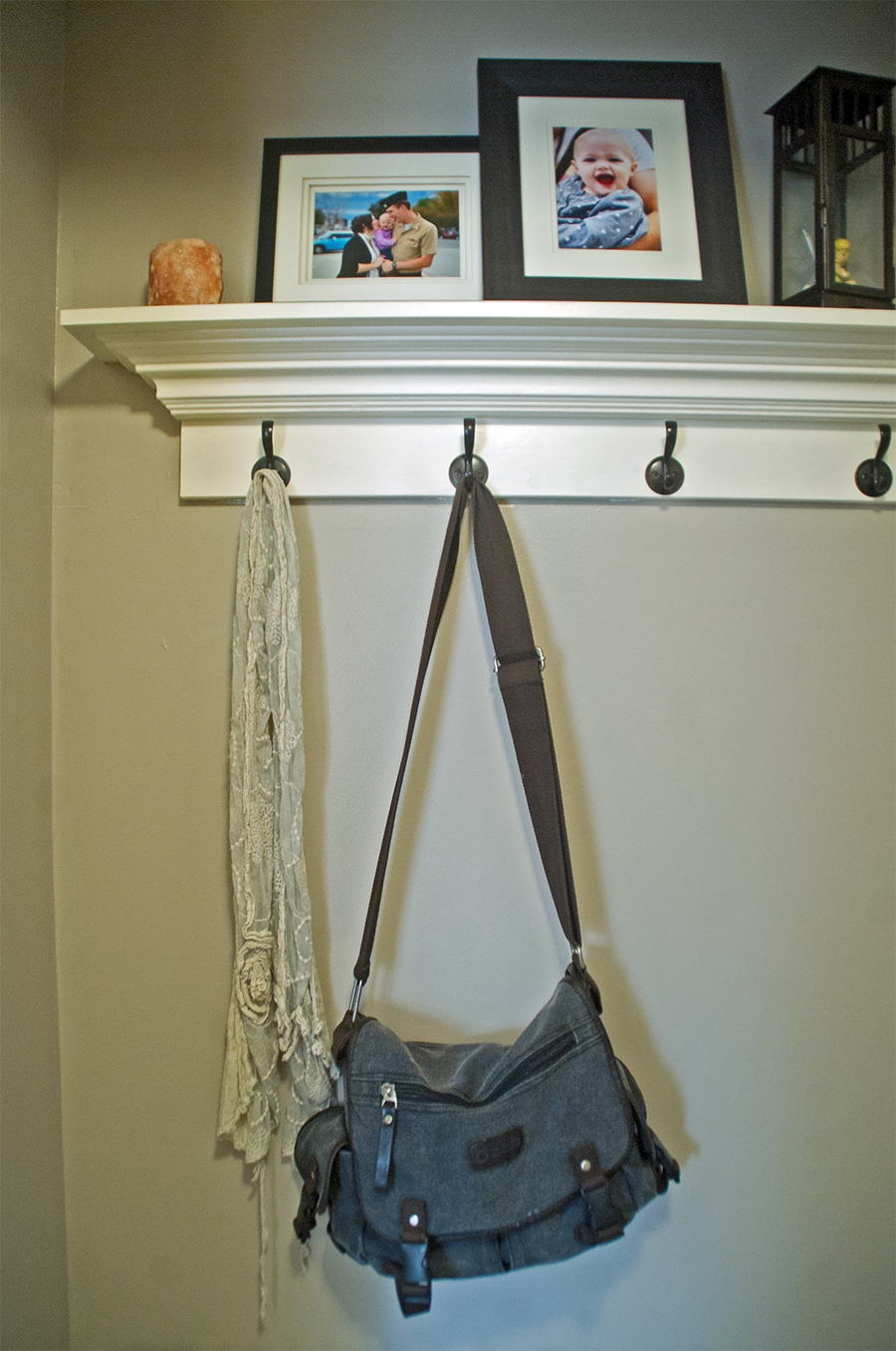
We filled the drywall holes and touched up the paint, then we made and installed a crown molding shelf and coat rack. Next we added decorative molding to the 2×6 boards and had it flow into the doorframe casing to make it appear less “boards nailed to the wall” and more “finished artisan bench”. (I also added a much thicker cushion than the one they previously had.) Then we bought some shoe baskets to put under the bench! And voila!!! New and improved entryway! Check it out!
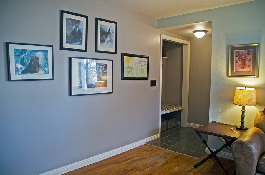
Now the baseboards for the entire entryway match and flow into the baseboards for the rest of the main living area. The tile also has an oak transition strip instead of just dropping off abruptly to the hardwood floor. Also note the new light switch plate and light fixture!
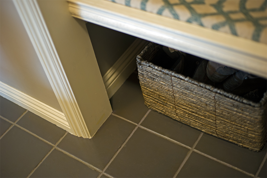
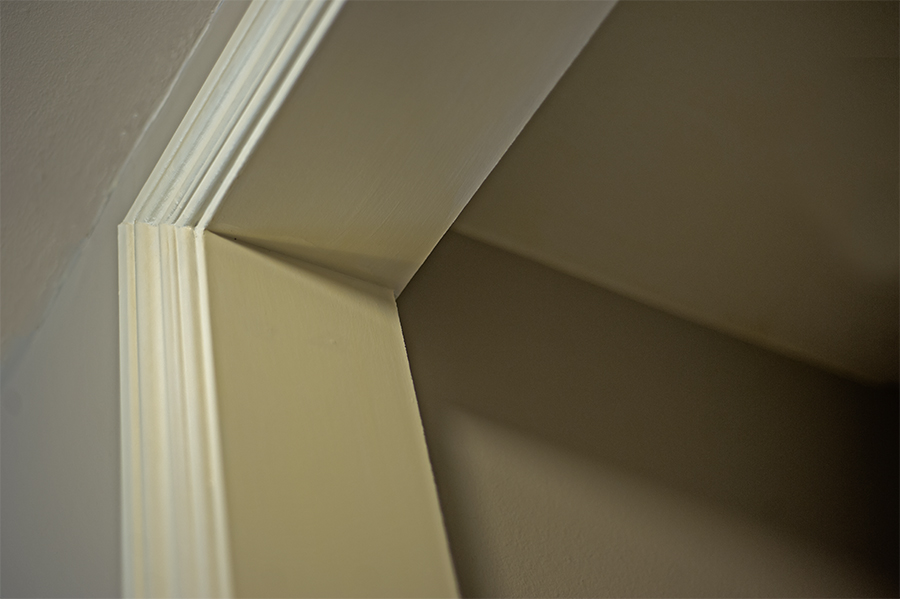
No more closet door tracks, or even signs of a closet door! The entry way has a finished open look, without a hint of a previous door frame.
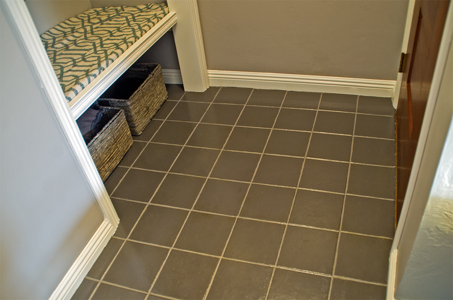
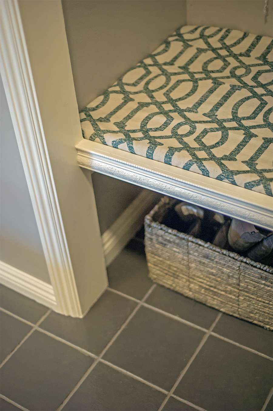
Check out the new veneer on the ceramic tiles! This project was a LOT OF WORK, but I think it was certainly worth it! I hated the brown broken tiles, and no matter how clean they were… they ALWAYS looked dirty! The slate grey blue works well with the surrounding wall colors, and the flat tone feels great and looks good (and is easy to clean!)


oh, I LOVE it!!! 🙂 it definitely looks 100 times better than the “before”!
Did you see my shout out to you guys? Huh?! Didja didja?! hehehe…
I love this! You sure have an eye for design. I especially love the tiles…what a great idea & such an amazing improvement. Well done sweetie.
I forgot to mention that the cushion fabric was a former curtain / thrift store find, haha! What’s funny is, it was the only fabric there that was the right texture, the right amount and was not hideous. I figured I’d be upgrading it soon.. but now that it’s there, it TOTALLY matches the color palette of the room! And that was soooo unintentional, lol!
Gingi… I love your makeover… it’s so pretty with all the crown molding.. It’s definitely much better in the after… you did such a fabulous job xox ♡
Thank you so much! Sometimes it’s hard to see the transformation when you’re so closet to a project! hehe.. I’m glad you like it!
Wow! You did a great jon here. I love the crown molding coat/rack! The smooth transitions and the added molding for the bench are really nice, too. 🙂
Yeah, I had been eyeballing the crown molding coat rack off of Pinterest before we even bought a house! So glad I had a place to use it here!
Wow, this looks great! I love seeing your home improvement projects!
Melanie @ meandmr.com
Thanks! I love sharing them! <3
You did great job.I like it!
http://fabuloustorture.blogspot.com
Thanks! <3
i love this, it’s so great 🙂 i hope you’re well!
mfashionfreak♥blog
Thank you so much! And you too! <3
Oh wow, you did such a great job! I love how it turned out! I have to admit that I absolutely fell in love with the red plant pot!
I actually found that at the Dollar Store!! And the snake fern plant was on sale at Lowes for $2… not bad for a $3 air cleansing plant, no? ^_^
I would like to take credit for this project because I babysat for two days and that kept Tessa from walking in paint. And I believe those two days were the most essential in the whole project. So it’s pretty much like I did most the work…
I guess you kind of have a point… I can’t even IMAGINE doing this with little Miss “I Want To Help With Everything”.. 😉
Wow – EXCELLENT job! You added functionality and beauty. Gonna share this out!
Thanks for the share on Twitter!! I really need to start using my Twitter account… I built it up then kind of.. forgot about it.. it’s on my list of things to focus on soon! (Yes, that is a real list, lol!)
love this!! my comment was longer but the dang password i copy and pasted wouldn’t work,hehe
I HATE when that happens!
I love it! It seems like you have an extra mud room now. What a great project and the woodworking looks super professional.
Thanks! I am VERY happy with the finished project!! <3
That is so cool. That is a neat place for all the shoes. I love it! I am really clueless on doing any of this stuff. You are talented at this 🙂
I really have no idea what I’m doing, haha. I would NOT have been able to do this project without our friends the Buckleys!
WOW!
What a beautiful makeover … I love the new look.
Enjoy it, I know you will
xx
Thank you! I am quite happy with the outcome! <3
I love this. It makes such a difference too.
Thank you! I am quite happy with it myself!! <3
Oh my goodness, it looks so totally wonderful! I’ll have to remember this for my future home.
Yeah, it was a pretty easy upgrade! Just very time consuming!
Love the molding you used! It came out beautiful. Can’t tell your nesting at all ;p
LOL, right?! My husband says the most expensive part of having more kids is the nesting, not the actual kids! hehehe!
I love this! I covet your bench 🙂 We just don’t have space for something like that, but I want it1
Take out a closet?? hehe! The bench is literally 3 2×6’s spaced out to fill the closet space!
Oh, it looks awesome!!! I love the shelf above the bench!
Thanks!! ^_^
how many good ideas and the house looks great. you are great guys.
xxx
mari
http://www.ilovegreeninspiration.com
Thanks!!! <3
Ok, I totally love the bench & the edge details. I love finding & admiring little things like that.
:] // ▲ itsCarmen.com ▲
Yeah, I insisted the bench have a pretty edge! My husband and our friend Buckley thought I was crazy, hehe.. but it’s my favorite part!
Thanks so much for stopping by my blog and for your nice comment. And wow, this turned out amazing! The bench is such a great idea and I love the decorative molding you chose. Nice work!
Gina – On the Daily Express
Thank you for stopping by!! I hope we can keep in touch! <3
Cool makeover! Always love a series of hooks in an entryway ’cause we always have something to hang up …
So good to meet you today, Gingi!
;-}
Thank you for stopping by Linda! I hope we can keep in touch!! <3
What a beautiful entryway! I love the coat rack and that bench is so perfect!
http://www.kathrineeldridge1.wordpress.com
Thanks! <3
Your entryway looks amazing!! Great job! I’m currently in the process of decorating our new apartment, it feels like its taking forever!
Thanks so much for stopping by my blog! 🙂
Thanks!! This project did take forever… I don’t know how people manage full home makeovers in like, a summer! lol… thanks for stopping by my blog! Hope we can keep in touch!
Love what you did! So cute
http://www.girlandthepolkadot.com/
Thanks! <3
I love the decorative edging to the bench, it looks very elegant and beautiful! The grey blue tiles definitely look much better than the original brown tiles too!
Prudence
http://www.prudencepetitestyle.wordpress.com
Yeah, I HATED those tiles.. they always looked dirty!! Thanks so much for your kind words!
I say you did a wonderful job turning the before (which looked like twas halfassed by the owners, like they just gave up on it and walked out kind of activity) and turned it into something that’s a million dollars worth. I loved that it looks much neater now, and put together with ZERO trace of messes anywhere. And that bench part is my fave along w/ the details of the edging piece. Good job!! 🙂
It totally WAS halfassed.. they did a LOT of projects around the house that were great ideas, but totally and completely half assed! Glad you like it! I’m quite happy with it!!
Love how it turned out, so neat and useful!
Great idea with the coat rack, loved this part most of all!
http://www.stripesnvibes.com
BlogLovin
Thanks!! I stole the idea off pinterest! hehe!
Yes, much improved! That is a part of our house that needs a lot of work – our entryway. I love yours.
Thanks Tamara!!! <3
Wow! What a tranformation! Love it, great job.
Thanks Linda!! <3
Love that you turn a closet in to a seat area.
Yeah, it’s a clever use of space I think!
Love the whole look! What a great job!
God bless,
XO, Claire
http://www.littlemissfashionqueen.blogspot.com
Thanks!! <3
I love the transformation. The crown molding coat rack is awesome. I’m not a fan of brown tile either.
Yeah, that brown tile was GROSS! Glad you like the transformation! <3
You’ve done a fantastic job! It looks lovely!
Thank you so much! <3
Super cute! I love the bench!
Thanks! <3
This looks so good. This is something I may have to copy and do to the ugly closet in our entry way.
It looks fabulous! I’d like to change up my entryway – it’s been the same for so long. You’ve inspired me!